The Font That Rocked the Campaign: Designer Aneesh Bhoopathy and the Visual Revolution Behind Mamdani’s Historic Win
- Bhoopathy’s introduction to Mamdani came organically. They connected immediately—two South Indian guys with similar politics and the same age.

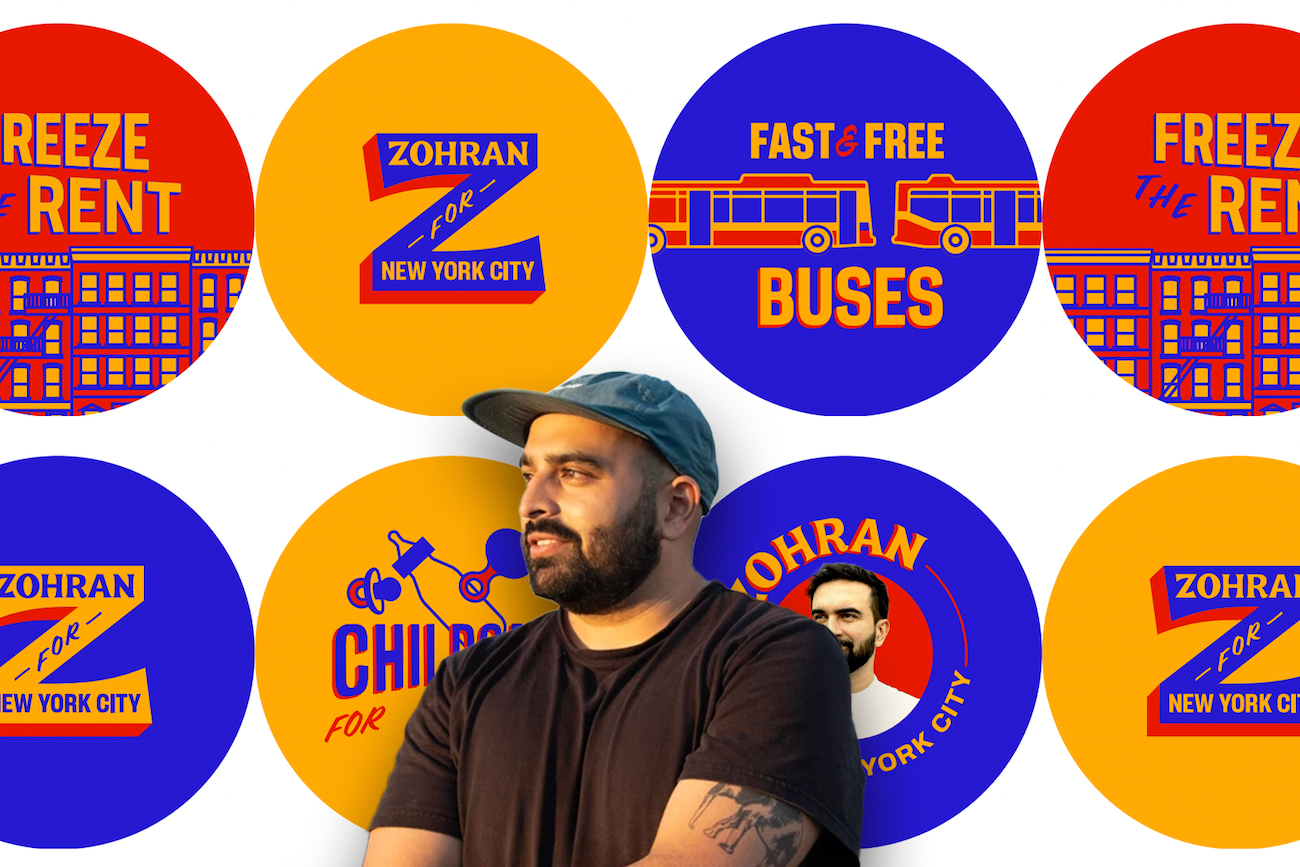
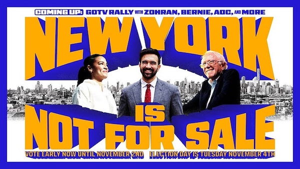
When vivid blue campaign signs with bold orange lettering began appearing across New York City’s storefronts and telephone poles last year, few observers knew that the man behind the breakthrough design was working not from a Manhattan studio, but from Philadelphia—and that his vision would help rewrite the rules of political branding.
Aneesh Bhoopathy, the Philadelphia-based graphic designer behind Zohran Mamdani’s visual identity, told The Hollywood Reporter that the campaign drew from the vibrant primary colors that help bodegas, yellow cabs, hot dog vendors and other small businesses stand out amid the city bustle. The stylized font—with its drop shadow effect and vintage comic book look—was meant to evoke old school, hand-painted signs still found in some neighborhoods. “Succinctly, it’s New York,” said Bhoopathy, who previously lived in New York and helped on past campaigns for Mamdani and the Queens chapter of the Democratic Socialists of America, according to ABC News.
A Designer Rooted in Movement Politics
Bhoopathy is a longtime member of Queens Democratic Socialists of America who worked with them on numerous campaigns, both electoral and issue-based, according to The Hollywood Reporter. The Philadelphia Inquirer reported that Bhoopathy, a former member of the Queens Democratic Socialists branch, has been working with Mamdani since around 2020, when he designed Mamdani’s campaign for state assemblyman.
His introduction to Mamdani came organically. As Bhoopathy explained in an interview with The Hollywood Reporter, Mamdani reached out during the 2020 assembly race, and they connected immediately—two South Indian guys with similar politics and the same age. The pandemic changed typical campaign operations like door-knocking and events, creating opportunities to put design thought into mailers and other materials.

Bhoopathy told The Hollywood Reporter he remembers Mamdani’s creative approach to communications early on: when Mamdani wanted to encourage people to take the census and explain its importance, he suggested making something that looked like New York State Lottery scratch-off tickets. According to Bhoopathy, it was exciting to work with someone who came up with ideas like that and was genuinely enthusiastic about visual possibilities.
Building a Democratic Design Practice
According to the Forge website, Forge is currently two longtime collaborators: Aneesh on design and Phil on all things technical. Though they split time between New York and Philadelphia and work with organizations worldwide, they are constituted as a co-op, which means they operate as a democratic workplace and ascribe to the seven cooperative principles.
The multilingual aspect shaped design decisions. Mamdani frequently spoke to constituents in Spanish and filmed videos in Urdu/Hindi. His printed material was translated into eight languages.
The Philadelphia Inquirer reported that Phil Ditzler handles the technical side, specializing in software engineering. Bhoopathy told The Inquirer that his partner’s work focused on building a website that was easy for supporters to navigate and sign up for volunteering opportunities.
Before designing Mamdani’s mayoral campaign, Bhoopathy designed graphics for his assembly run and has also worked with New York State Senators Julia Salazar and Jabari Brisport, according to Fast Company.
The Philosophy Behind the Design
Bhoopathy told Graphic Design USA the mood board drew heavily from iconic New York visuals: “Taxicab yellow, MetroCard primary colors, bodega awnings — stuff people are familiar with in the New York street.”
The design process was guided by practical constraints. “Thinking of people walking by on foot, you probably have two seconds max for someone’s attention,” Bhoopathy explained to Graphic Design USA. That constraint guided the design: minimal copy, clear messaging, and bold visuals.
The Philadelphia Inquirer reported that Bhoopathy designed fliers and door hangers for volunteers, with different versions available in eight languages. “This campaign is uniquely disciplined and sharp,” Bhoopathy told Fast Company of the messaging.
The multilingual aspect shaped design decisions. According to Fast Company, Mamdani frequently spoke to constituents in Spanish and filmed videos in Urdu/Hindi. His printed material was translated into eight languages, some written in characters and some read right to left. The need to be nimble influenced the identity Forge designed.
Embracing the Remix Culture
Bhoopathy told Fast Company these experiences taught him that the branding for progressive candidates is often memed—like the famous Hot Girls for Zohran shirts. “One thing about working in leftist campaigns is knowing that people are going to remix, screen print, and make their own things,” Bhoopathy said. “And so you have to be comfortable with letting things take on a life of their own and not feel too precious about it, like you might be with a corporate brand.”
The viral success proved his point. ABC News and Fortune reported that the popularity of Mamdani’s designs helped inspire off-beat, viral campaigns such as the “Hot Girls for Zohran” merch worn by model Emily Ratajkowski and other young celebs.
Design as Political Strategy
David Schwittek, a professor of digital media and graphic design at Lehman College, observed to ABC News and Fortune that the campaign’s aesthetic wasn’t merely stylistic: “They evoke the working-class fabric of New York City: the bodegas, taxi cabs, and halal carts that not only sustain the city but also reflect its cultural richness.”
Schwittek told these outlets the key takeaway from Mamdani’s visual coup was that effective branding isn’t generic or safe, but specific and deliberate. “In a sea of sanitized political messaging, Mamdani’s visuals stand out because they mean something,” he said. “That’s the lesson.”
Gavan Fitzsimons, a business professor at Duke University who studies branding’s impact on voters and consumers, suggested to ABC News and Fortune that the decidedly retro vibe likely helped foster “positive associations to happier political times,” at least among Democratic voters.
Kingsley Spencer, a design observer quoted by The Philadelphia Inquirer, noted the cultural depth of Bhoopathy’s choices. Spencer said the colors are non-traditional and have cultural meaning outside of politics, like taxi or MTA yellow and a twist on Dem blue, invoking the Mets and Knicks, clearly making it New York.
Spencer added to The Inquirer that Bhoopathy’s focus on the hand-lettered “Z,” using it as a focal point, is “genius.” “It appears like his entire brand is a design love letter to the city itself,” he said. “Overall, it’s extremely approachable, looks distinctly New York, is clearly built around his personal identity, and was made for flexibility. It clearly contributed to why he succeeded, I’d wager.”
The Candidate’s Role
What ultimately set the campaign apart was how closely the design reflected Mamdani himself, according to Graphic Design USA. He had strong personal opinions about the branding and a deep understanding of its communicative power. “I admire his attention to detail, his belief in the power of design to communicate ideas, and his willingness to get creative with it,” Bhoopathy told the publication.
Bhoopathy emphasized authenticity to ABC News and Fortune. “None of the boldness and vibrancy here works without a candidate that is as energetic and full of life as the city that raised him,” he said.
A Broader Portfolio
The Philadelphia Inquirer reported that beyond political campaigns, some of Forge’s other design clients include a New York-based non-alcoholic sparkling wine, a loungewear company, and a bakery out of New Jersey.
As New York City prepares to inaugurate its first Muslim and South Asian mayor on January 1, 2026, Bhoopathy’s work stands as evidence that political design can be both culturally specific and broadly appealing—that a hand-drawn wordmark and bold colors can capture not just attention, but imagination. His yellow-and-blue revolution proved that in politics, as in the bodegas and taxi cabs that inspired it, standing out isn’t just about being loud—it’s about being authentic.
This story, conceptualized and edited by American Kahani’s News Desk, was aggregated by AI from several news reports.


